
RShiny for prototyping + plotting two different user-input variables
Last week after some team meetings I started using RShiny to prototype a webapp for a project I’m working on to show users how many resources (i.e. time, memory, CPUs) they might need for running various bioinformatics programs on our computing cluster. This was after several projects we had were stalled out on the public-facing piece due to our single front-end developer leaving and the rest of our collective lack of experience. There was one app, RefChef, built with React/Ember, and a few others had been started in Vue/Nuxt. None of us had done anything in Javascript (I had done a little d3 before but it was more of the copy d3 examples and adjust values type) and certainly not any JS frameworks. The learning curve turned out to be pretty big given that software engineering tends to be our last priority and research/analyses our first priority - several months later I still haven’t quite been able to combine existing components into a working interactive page.
Pivot to RShiny. I have so much more experience and familiarity with R, including writing R packages. The turnaround time to a working prototype has been drastically less. I was able to get a basic app up of what I wanted in about an hour and finish the whole thing in another hour or 2 including reading through tutorials.
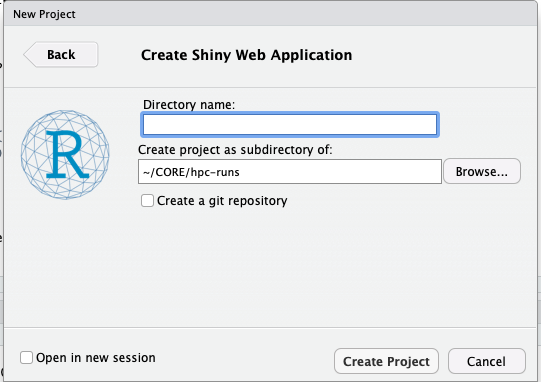
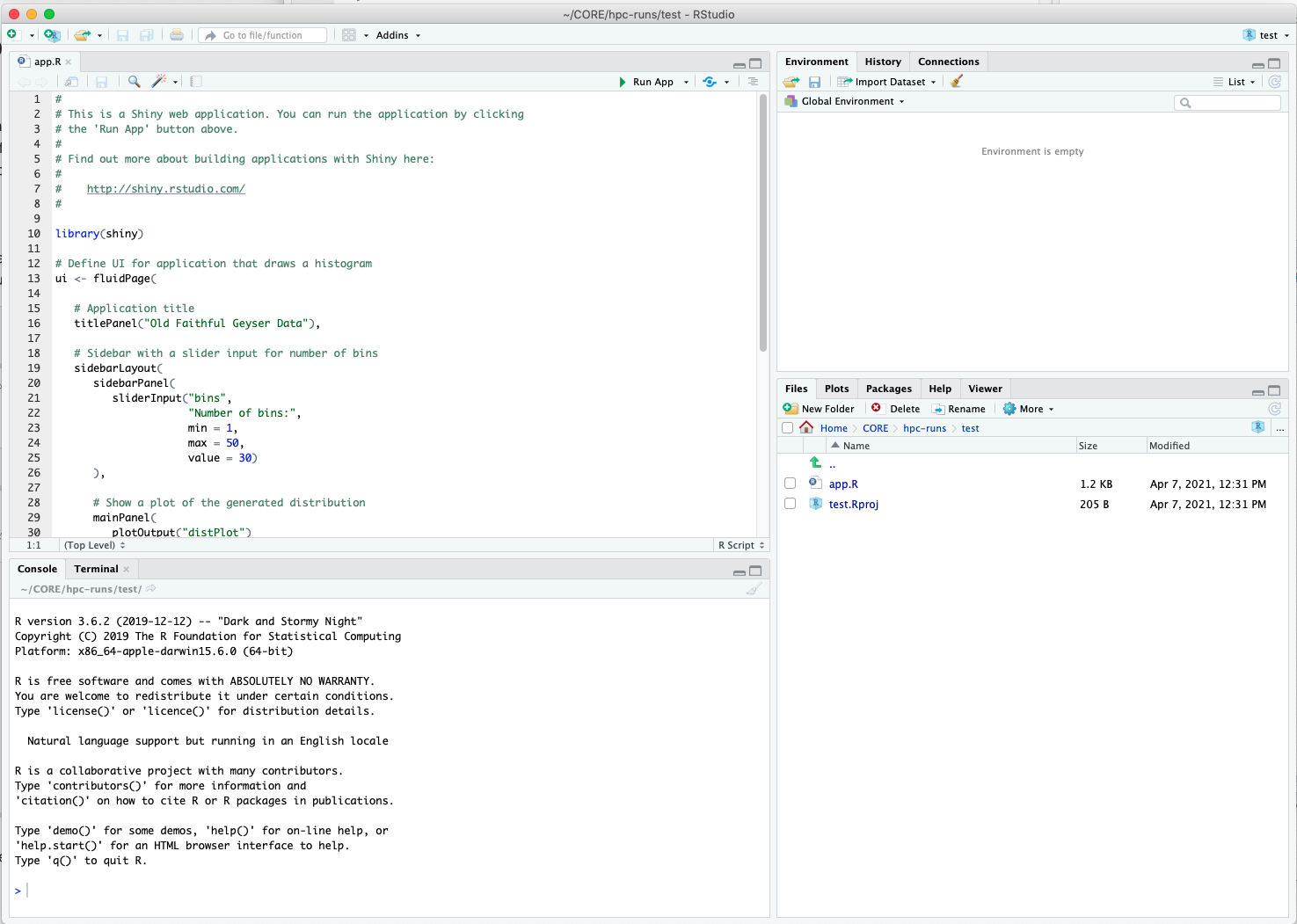
Getting started was a matter of starting an RShiny project from RStudio, once you make it they immediately start you up with an app.R example you can build off of.
 |
 |
In terms of resources for learning RShiny, I’ve just been following along with the tutorials posted from their page on RStudio. They have a wide mass of videos and articles. What was most useful for me were the basics, understanding reactive components, and the Database basics. The next step would be to switch to using pool and dplyr to query an actual DB rather than feed in a CSV, make the plot interactive / into a dashboard, and be able to plot multiple variables categorized by color on a single plot. These are all extras though, I already have my MVP.
You can see the prototype on aguang.shinyapps.io. With this I can now go back to focusing on the backend, i.e. pulling more data, standardizing units, setting up a DB.
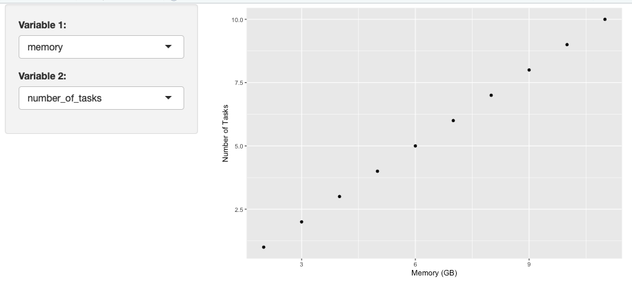
Plotting two different user-input variables
Of course some things I had to figure out on my own. One was that I wanted the user to be able to choose the variables they plotted on a scatter plot and also have nice axis labels. At first I thought I could just pass in input$var1 and input$var2 to ggplot, but the problem is that they would get interpreted as the actual strings rather than variable names (a common difficulty in other areas with tidyverse… I have memories of dealing with this in other instances but now can’t remember how) This would result in a plot of a single point that was string1 vs string2.
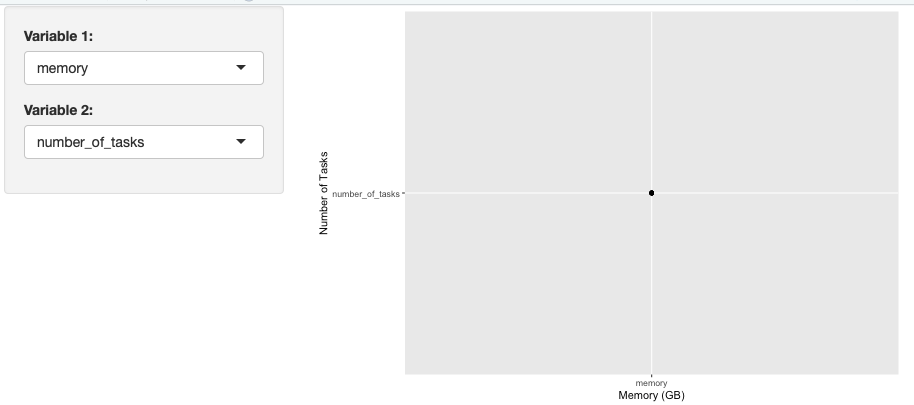
The correct way to do did not seem to be found in the RShiny tutorials or a quick StackOverflow search.
The solution I came up with was to make use of dplyr::rename, a new function I learned about. Basically, I wrote three reactive functions. One renames the variables of interest to var1 and var2 so that when I go to ggplot I can use a single line that passes in var1 and var2 as column names instead of strings. The other two are just switch statements that take in the input and output strings for axis labels, they are then run inside xlab and ylab respectively.
The code to reproduce is below.
library(shiny)
library(tidyverse)

ui <- fluidPage(
	sidebarPanel(
		selectInput(inputId = "var1",
                      label = "Variable 1:",
                      choices = c("number_of_tasks","cpus_per_task","memory","time","file_sizes"),
                      selected = "memory"),

        selectInput(inputId = "var2",
                      label = "Variable 2:",
                      choices = c("number_of_tasks","cpus_per_task","memory","time","file_sizes"),
                      selected = "file_sizes")
                ),
    mainPanel(
    	plotOutput("distPlot"))
    	)

server <- function(input, output) {
	# this is example data for a minimal example
	data <- data.frame(number_of_tasks=seq(1,10,1),
                       cpus_per_task=seq(1,10,1),
                       memory=seq(2,11,1),
                       time=seq(1,10,1),
                       file_sizes=seq(1,10,1))

    # renames variables of interest to var1 and var2 for ggplot
	plotInput <- reactive({
		rename(data, var1=input$var1, var2=input$var2)
		})

	# reactive component for desired labels
	var1_lab <- reactive({
        switch(input$var1,
               "number_of_tasks" = "Number of Tasks",
               "cpus_per_task" = "CPUs per Task",
               "memory" = "Memory (GB)",
               "time" = "Time (s)",
               "file_sizes" = "Input Size (GB)")
    })

    var2_lab <- reactive({
        switch(input$var2,
               "number_of_tasks" = "Number of Tasks",
               "cpus_per_task" = "CPUs per Task",
               "memory" = "Memory (GB)",
               "time" = "Time (s)",
               "file_sizes" = "Input Size (GB)")
    })

    output$distPlot <- renderPlot(ggplot(plotInput(), aes(x=var1,y=var2)) + geom_point() +
        xlab(var1_lab()) +
        ylab(var2_lab()))
}

shinyApp(ui = ui, server = server)